2022

PROJECT INFO
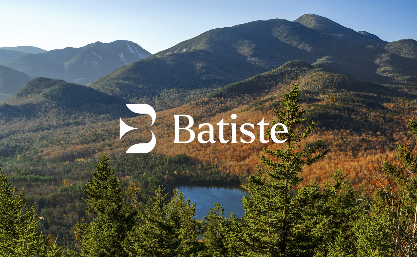
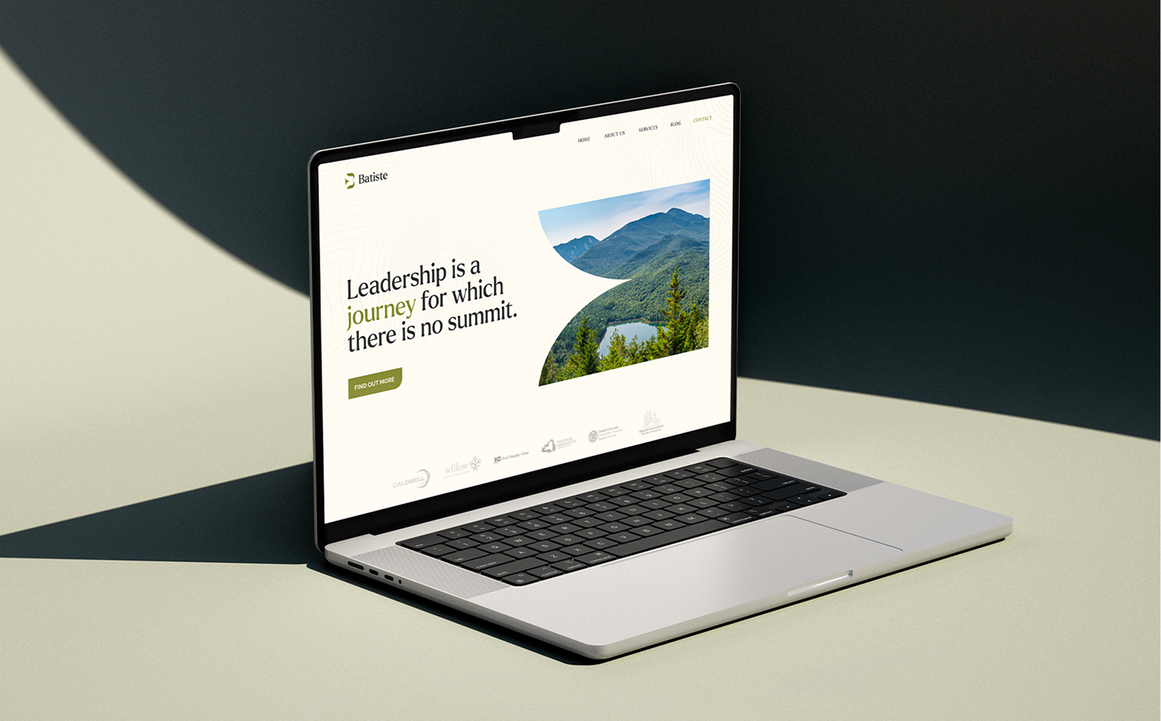
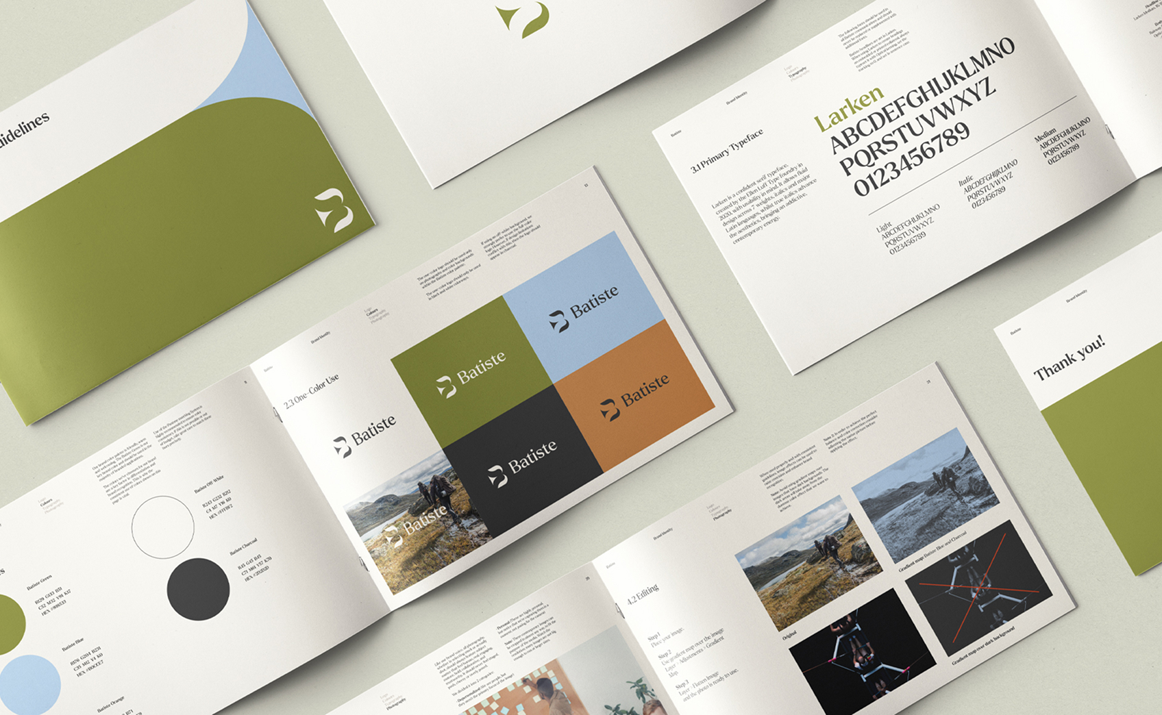
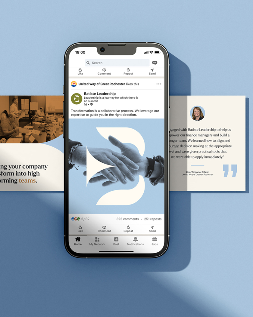
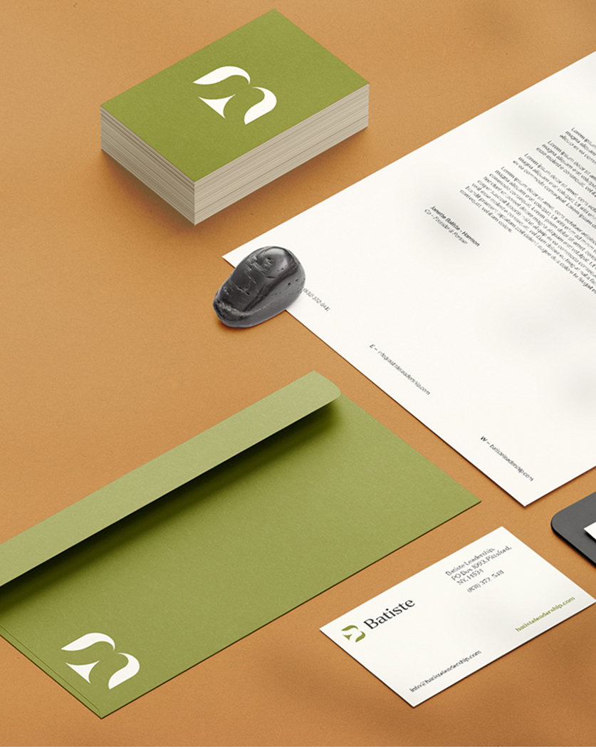
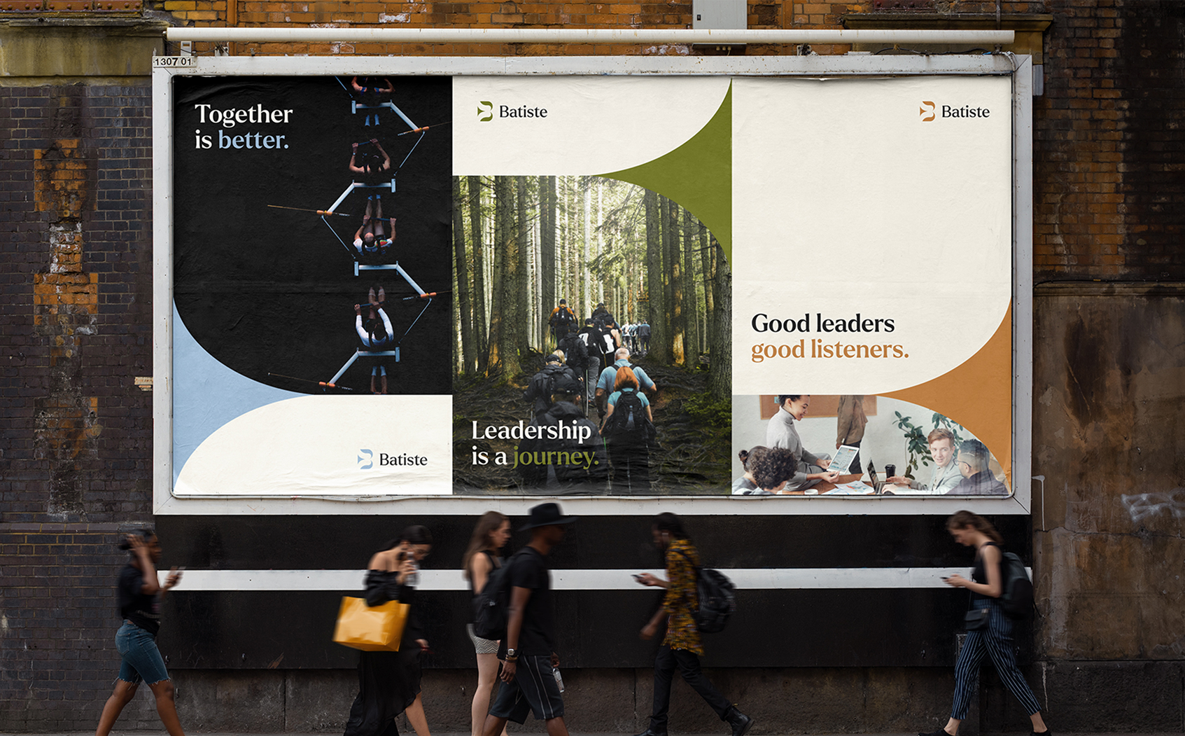
Batiste is a leadership consultancy based in upstate New York, recognized for inspiring meaningful change in leaders and teams. Leading a team of creatives, we developed a brand identity that conveys both the distinct value they offer—strategic planning, team development, and leadership growth—and the approachable, grounded character of its founders.
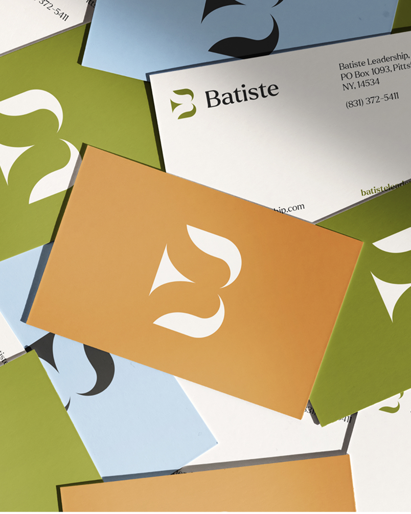
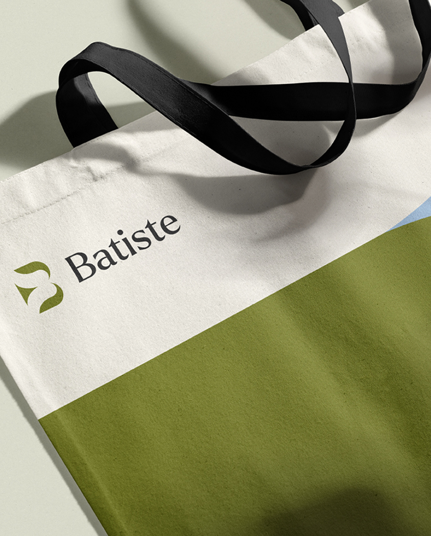
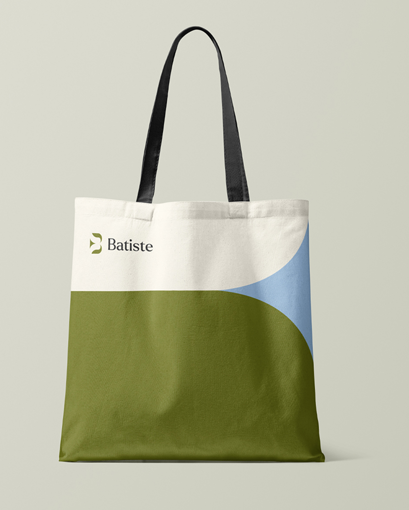
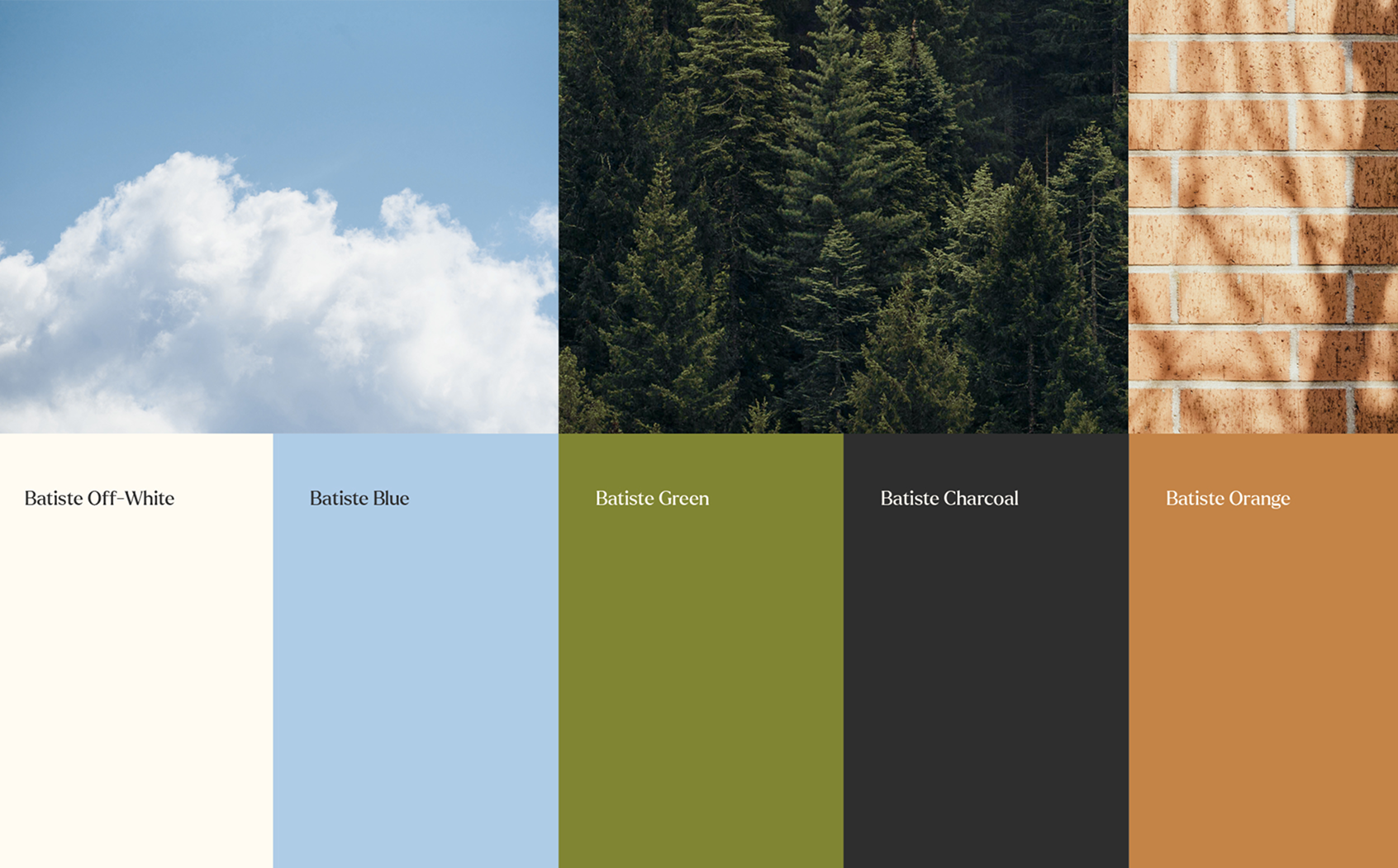
We designed a refined mark featuring the letter 'B' and a bird, symbolizing progress and subtly suggesting a way forward. The color palette was inspired by the natural beauty of upstate New York: the blue of the Rochester waterfalls, the green of the Adirondack Mountains, and the orange of fall’s turning leaves. These bright, positive colors help ground the brand, instantly putting people at ease.
Location
Rochester, New York
My role
Brand Strategy
Creative Direction
Team Management
Digital Design

PROJECT INFO
Batiste is a leadership consultancy based in upstate New York, recognized for inspiring meaningful change in leaders and teams. Leading a team of creatives, we developed a brand identity that conveys both the distinct value they offer—strategic planning, team development, and leadership growth—and the approachable, grounded character of its founders.
We designed a refined mark featuring the letter 'B' and a bird, symbolizing progress and subtly suggesting a way forward. The color palette was inspired by the natural beauty of upstate New York: the blue of the Rochester waterfalls, the green of the Adirondack Mountains, and the orange of fall’s turning leaves. These bright, positive colors help ground the brand, instantly putting people at ease.
Location
Rochester, New York
My role
Brand Strategy
Creative Direction
PROJECT INFO